Travel App
Ghoulish Getaways
Project Overview
For this project we had to create a travel app with emphasis on illustration, icons, diagrams and charts. We were given a lot of creative freedom with this project because when could pick any form of travel we wanted for example, hiking routes, road trips, traveling through the human body, etc. We needed to have a minimum of six screens that include a home/ launch screen as well as a chosen destination screen.

Research
My research for this project was abut existing travel apps and choosing what aspect of travel I wanted to focus on. There was occurs an abundance of holiday traveling apps but I wanted to do something a little bit different. With my love of all things dark and spooky I decided to create a travel app that brought you to different haunted locations, for those who are interested in places with dark backgrounds and sometimes gruesome histories.
Sketches/Wireframes
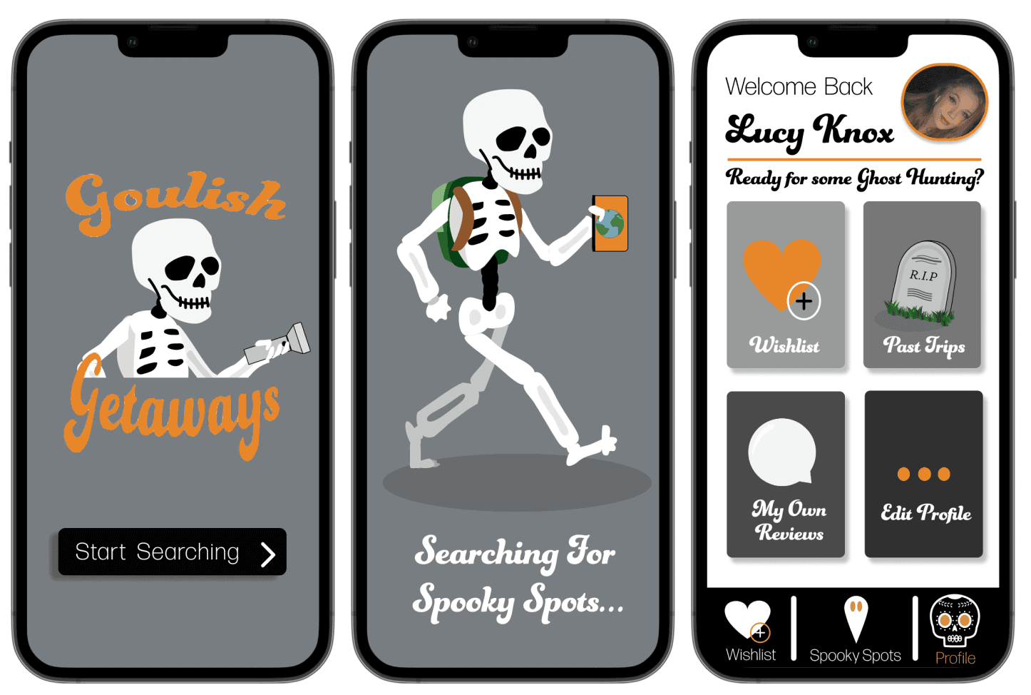
Next came the sketches of various icons for the app and mascots for the launching screen specifically. I originally had an idea of having an image of the earth but with some of the greenery configured slightly to make it look like an evil grin. I was most excited to create this in my lo-fi designs. For the wireframes I just wanted to see what pages I could come up with and how it would all look together on one screen.

Lo-fi Mockups
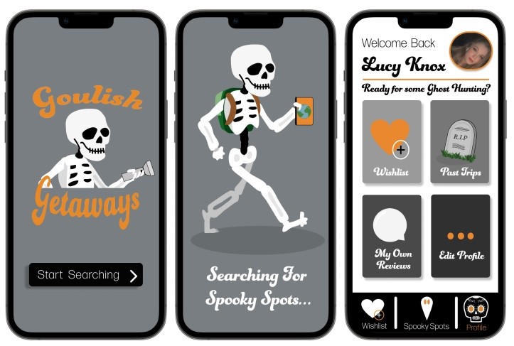
Similarly to the infographic mockups, these were not looking great. I again messed up with the colour scheme by not having a set one in place and paying way to much detail into tiny icons that then become too busy and cramped looking. I had a lot to redesign but I knew what I needed to improve.
High Resolution Redesign
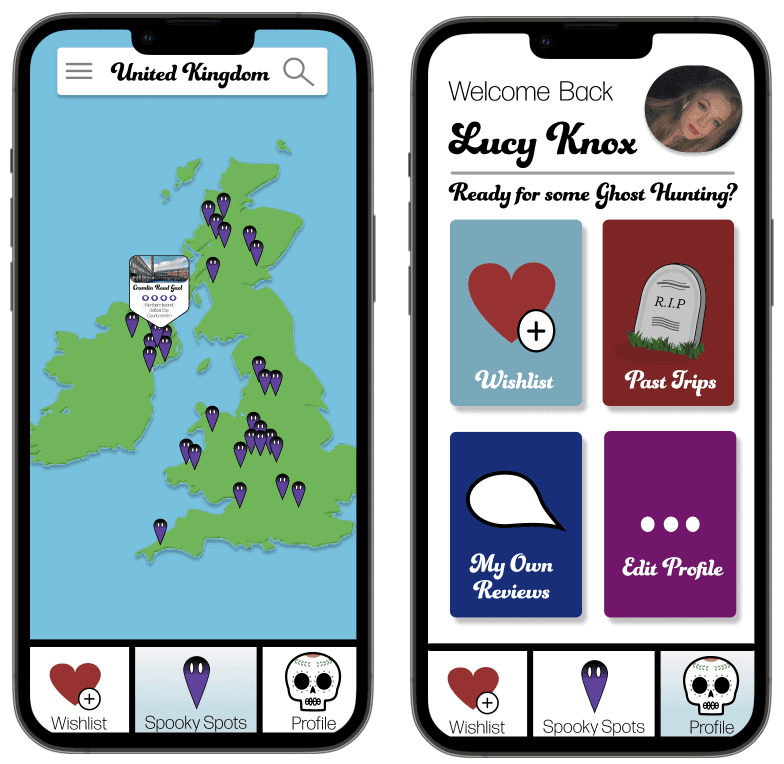
Thankfully, my high resolution redesign turned out far better than my mockups had with even more screens and a better use of type size and icon design, everything looked much clearer. The colour scheme helped the most I think with creating continuity between the screens and the bright orange colour against the monochromatic colour scheme helped highlight specific points of the design.